Ginger App
An app that helps people with mental health challenges through personalized content, behavioral health coaching, therapy, and/or psychiatry.
The Challenge(s)
Feedback from a large data set of users signaled the mobile experience was in dire need of a refresh: it successfully connected users with a coach, however, engagement was low with drop-offs at every step of the user journey and there were major usability and accessibility issues across multiple features of the app. Additionally, the company had recently acquired a new library of interactive content, was in the middle of a rebrand, and the mobile engineering team was transitioning onto a new development platform.
As the sole product designer, I was tasked with reimagining the app experience to increase engagement, incorporate this new library, and take on a visual refresh while closely collaborating with cross-functional stakeholders.
Discovery Workshop
I partnered with our product managers on running a design discovery workshop to better understand Ginger’s users through the lense of our coaches who interact daily with our users. I hosted these workshops with 20+ of Ginger’s coaches.
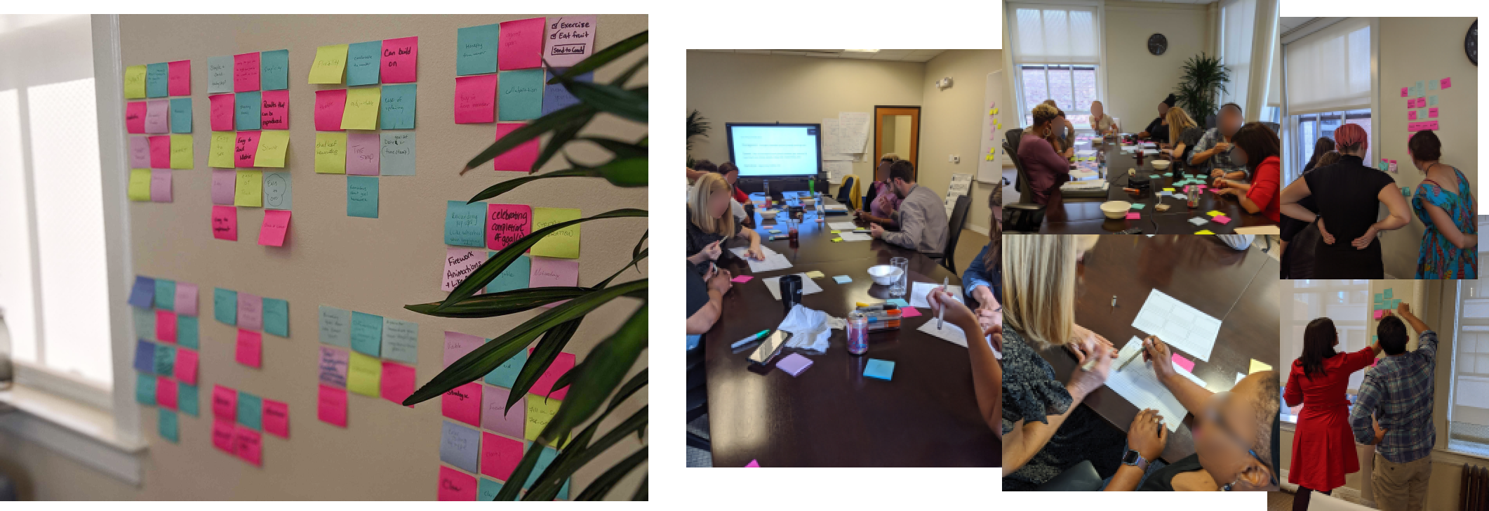
Affinity map (left) and a small group of coaches (right) from the first workshop
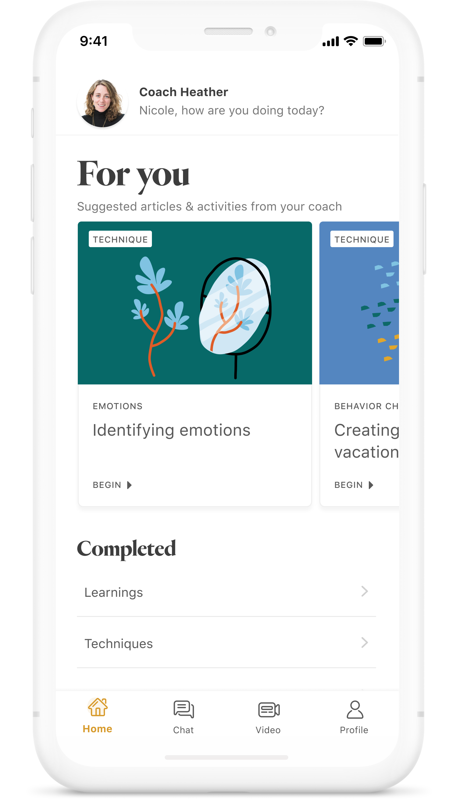
Feature 1: Home
Before diving into design exploration, I conducted an audit of the existing app to gauge ux patterns, assess whether there were reusable components, assets, or copy, and ensure the transition into the new experience was as frictionless as possible for both new and existing users.
I then sketched ideas and transformed them into digital wireframes, ideating through close collaboration with our PM and lead engineer. During this exploratory phase, I decided to restructure the information architecture and add new components. I collaborated with product to revise copy, ensuring titles, labels, and phrases throughout the app sounded like one uniform voice.
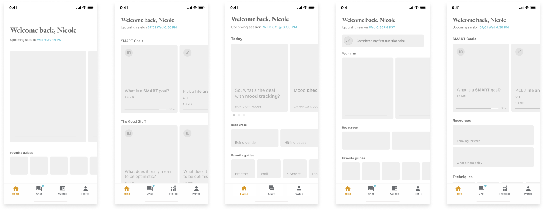
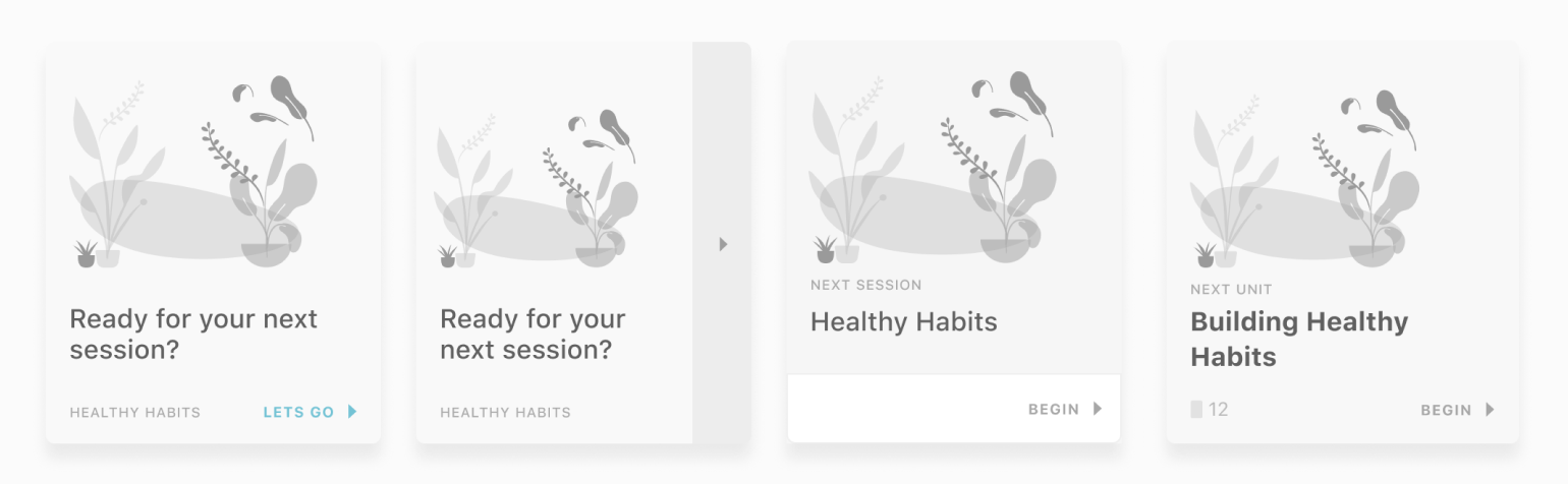
A few or many exploratory wireframes
I gave special attention to the top of the home screen, taking careful consideration of what the app was already successful in providing value: connecting users with their coach.
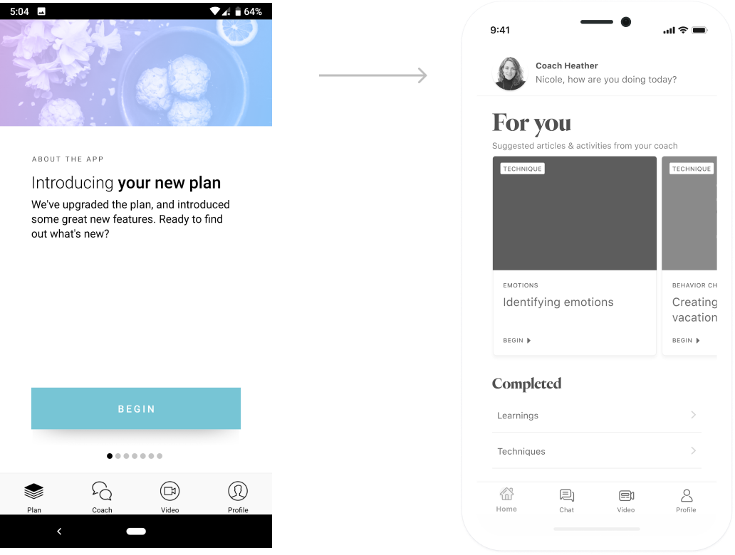
From legacy home screens to new home screen in mid-fidelity
Introducing a new header component called for exploration of new components for the lessons feature. Meanwhile, I worked alongside our visual designer to play with visual direction, exploring typography and various illustration and photography treatments. Thus, at this stage, I created mid-fidelity wireframes leading discussions on both UX and visual design.
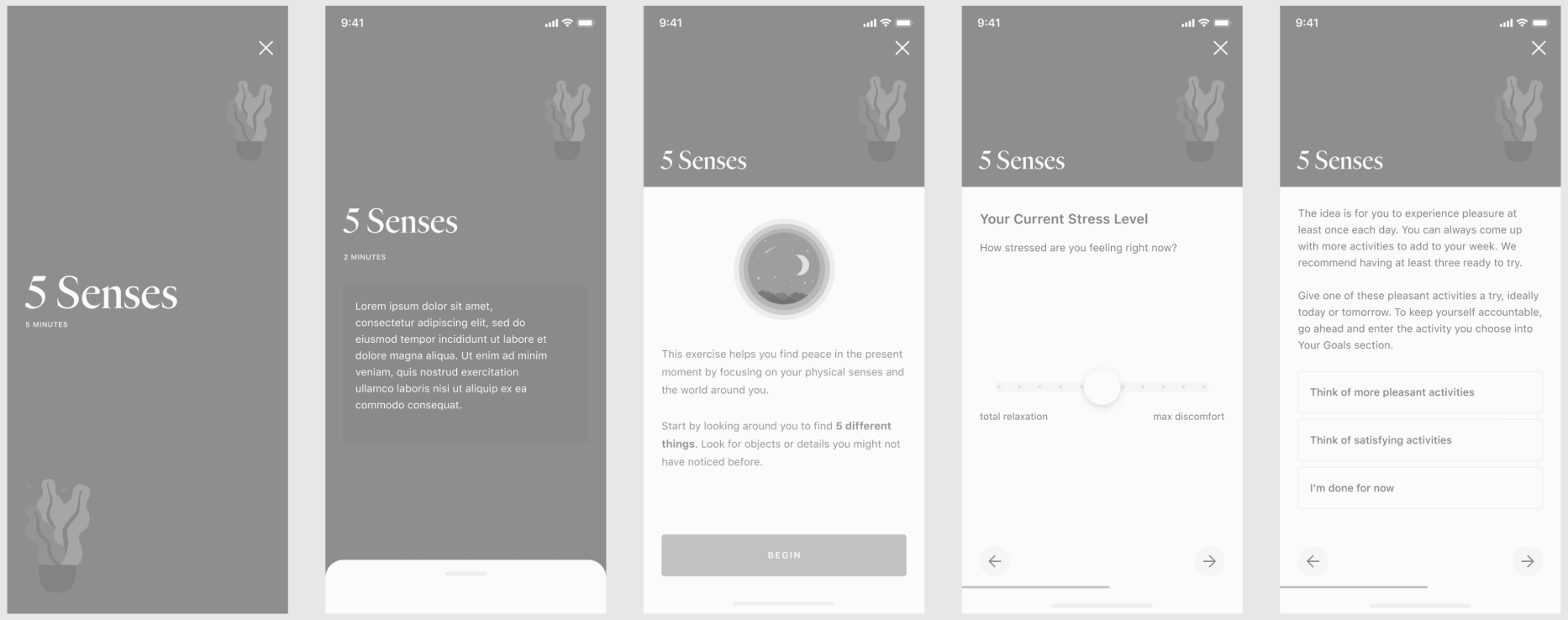
A few of many exploratory wireframes
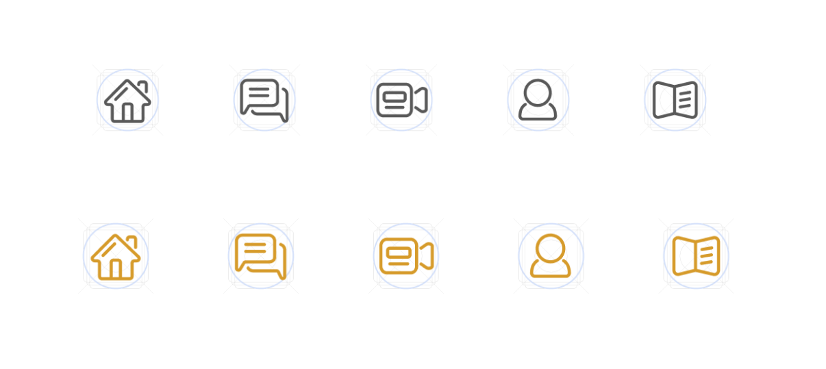
I designed new navigation icons, using smooth corners and edges to evoke the feeling of softness and approachableness in our Ginger brand colors.
We consolidated user feedback into insights, shared with the broader product and engineering teams, then collaborated on scoping work to this initial MVP and future phases.
Feature 2: Interactive Lessons & Activities
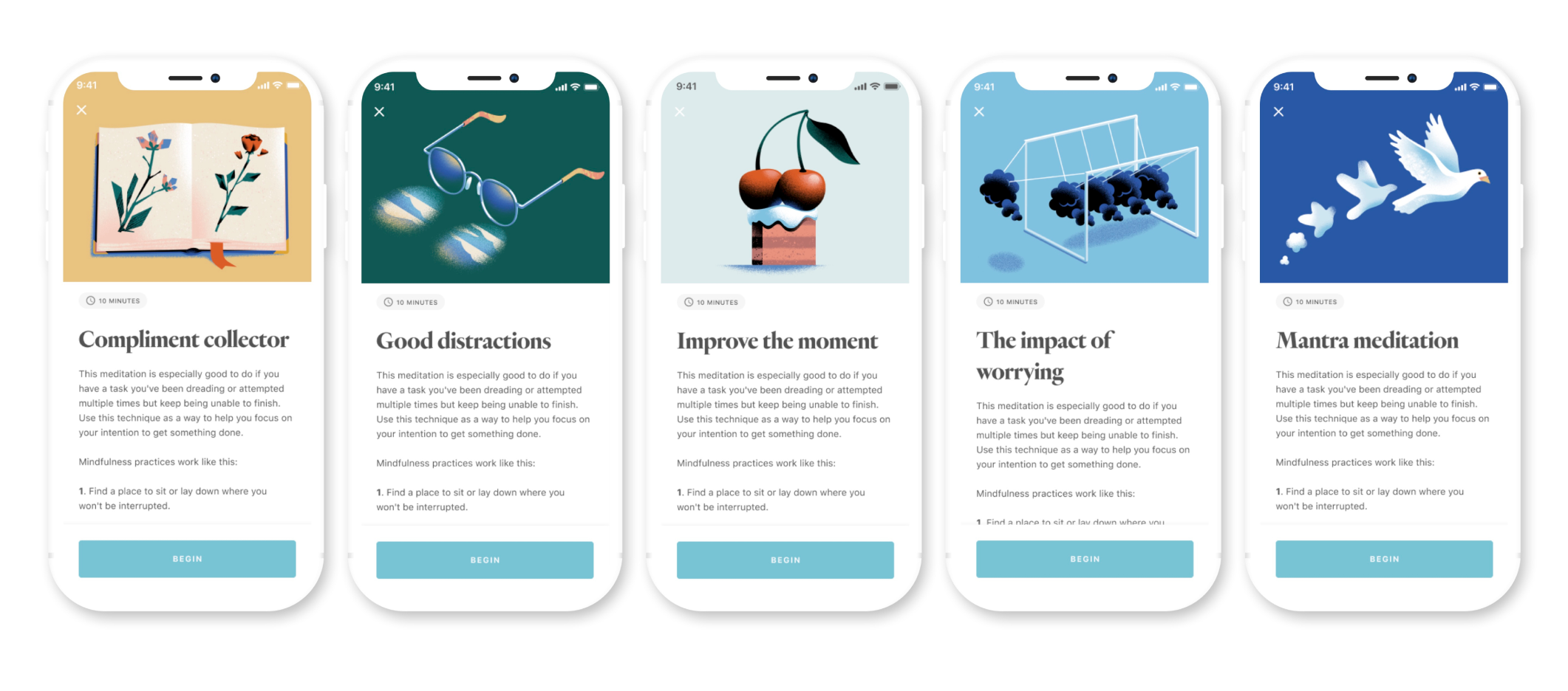
Incorporating a new content library required new interactive components. Creating a feeling of calm and support was achieved through clean layouts paired with simple and elegant mini-interactions. I created a style guide.
Layout and new component explorations
I collaborated with our visual designer who defined the vision and guiding principles for the illustrations on these activity cards while I designed and the layout, components, and typography rules. We hired a few freelancers to help with creating over 50 illustrations in a short timeframe.
Learnings and Next Steps
After conducting 7-8 user research sessions, we learned:
(1) People preferred cards as a UI component over a full-screen carousel.
(2) Some users found the high-level category label on the cards confusing. They would have prefered more
detailed labels.
(3) Users said they wished they could track their activity progress somewhere in the app. Some were logging
their progress on paper or spreadsheet.
(4) Users wished to see whether or not they missed a coaching or therapy session and to easily re-schedule them.
(5) Some people wanted to journal about their experiences, whereas some were strongly opposed to journaling and
said they didn’t have the time.